14 · Web Design
Äther Haus Studio
Portfolio site with bold typography and color language for a creative studio.
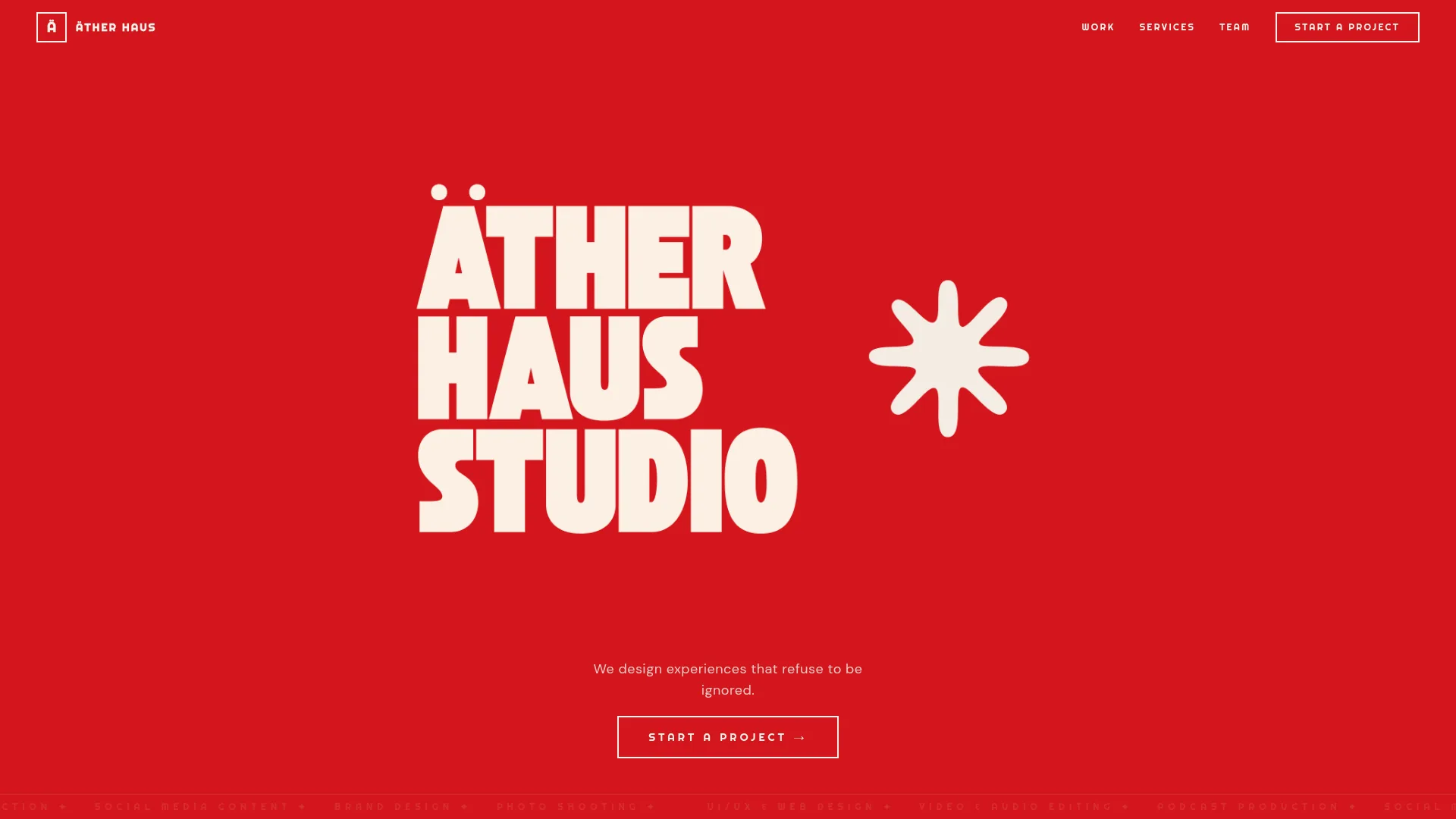
This website we designed for Äther Haus reflects the studio's bold and attention-grabbing identity through a vivid red palette, massive display typography, and playful graphic elements. The brand manifesto, 'experiences that refuse to be ignored', is woven into every interaction on the page.
Case
Challenge
Äther Haus already had a bold creative character, but its digital storefront did not communicate that energy at first glance or separate the studio clearly from its peers.
Approach
We turned the brand manifesto into the central idea of the experience, connecting every touchpoint through a vivid red palette, large-scale typography and a controlled motion system.
Outcome
The result is a distinctive, coherent digital identity that does more than display the portfolio: it communicates the studio's character from the very first scroll.
A similar project?